Graphics
parmest includes the following functions to help visualize results:
Grouped boxplots and violinplots are used to compare datasets, generally before and after data reconciliation. Pairwise plots are used to visualize results from parameter estimation and include a histogram of each parameter along the diagonal and a scatter plot for each pair of parameters in the upper and lower sections. The pairwise plot can also include the following optional information:
A single value for each theta (generally theta* from parameter estimation).
Confidence intervals for rectangular, multivariate normal, and/or Gaussian kernel density estimate distributions at a specified level (i.e. 0.8). For plots with more than 2 parameters, theta* is used to extract a slice of the confidence region for each pairwise plot.
Filled contour lines for objective values at a specified level (i.e. 0.8). For plots with more than 2 parameters, theta* is used to extract a slice of the contour lines for each pairwise plot.
The following examples were generated using the reactor design example. Fig. 3 uses output from data reconciliation, Fig. 4 uses output from the bootstrap analysis, and Fig. 5 uses output from the likelihood ratio test.
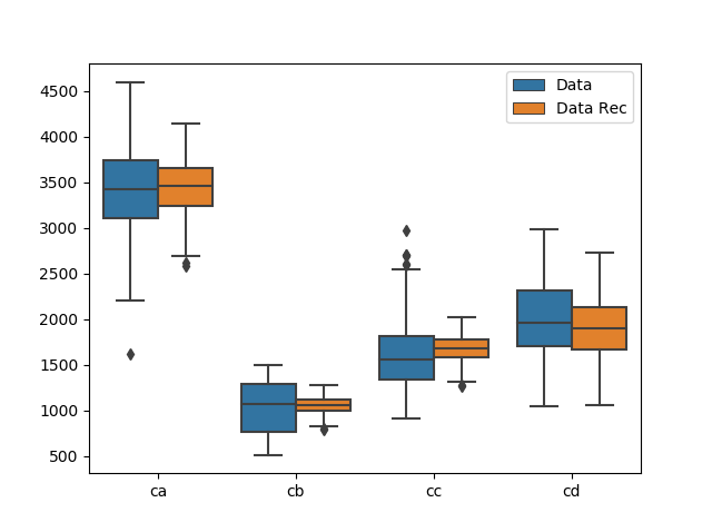
Fig. 3 Grouped boxplot showing data before and after data reconciliation.
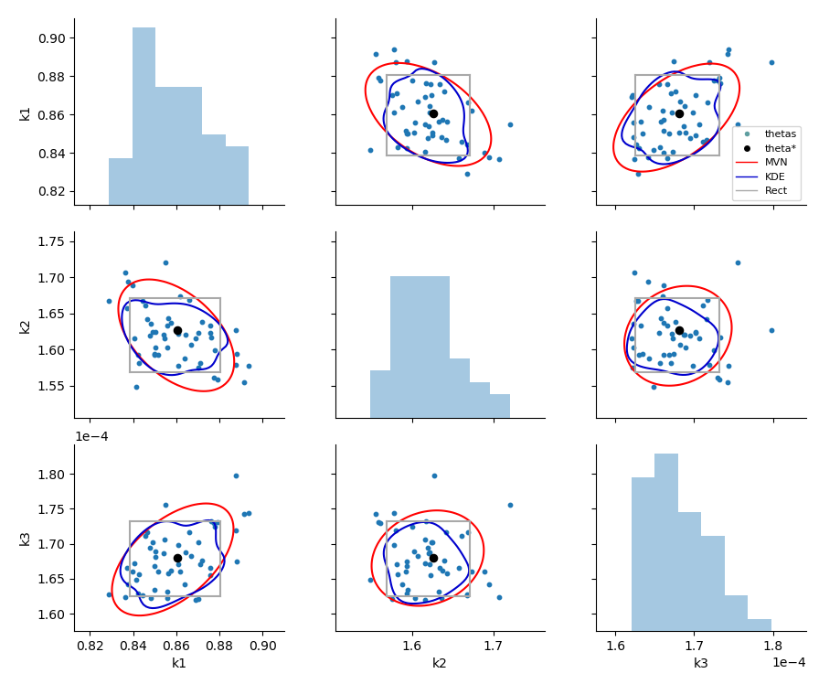
Fig. 4 Pairwise bootstrap plot with rectangular, multivariate normal and kernel density estimation confidence region.
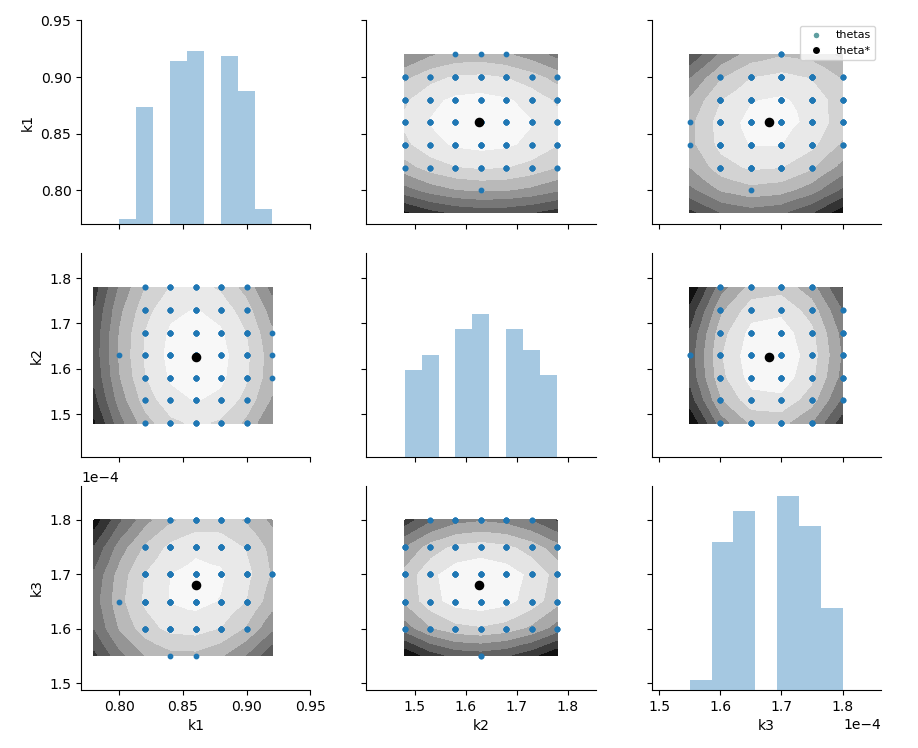
Fig. 5 Pairwise likelihood ratio plot with contours of the objective and points that lie within an alpha confidence region.